Corona Ramblings
Coronavirus: deaths by age
Often the media cites the figures that the most vulnerable age group of the population is those from 60 to 69, with a graph such as the one below to corroborate the statement.
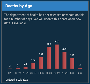
Fig 1. Coronavirus deaths by age group
A graph like this is rather meaningless, as all this tells you is of the total population, how many people in each age group has died - no comparison can be made between these numbers until you know how many people, of the total population, is in that age group. By dividing the number of deaths in an age group by the number of people in that group, one gets the fraction of the total population who died in that age group. These numbers can then be compared.
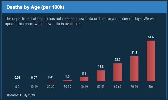
Fig 2. Coronavirus deaths per 100000 population by each age group
As you can see from fig 2, the people most vulnerable to the disease are those in the group 80+. Everyone over 50 is at risk, but the very old, more so.
Although the data shown is specific to South Africa, the shape of the graph shown in fig 1, is seen worldwide.
To do analysis, such as shown in fig 2, one needs reliable census data to establish the number of people in the groupings. South Africa's census data is reasonably reliable and up-to-date.
References
The graphs were taken from Media Hack Collective on 1 October 2020.
(updated: 1 October 2020)