Ramblings
Coronavirus deaths
UpdateAlthough this page may not be updated every day, most of the graphs are updated at least every second day. Do check back regularly to view the graphs (a page refresh may be required, which is F5 for most browsers). Latest update 13 December 2021.
I made a major update to this page on 18 October 2020, I have changed several things since I started it in April 2020.
One of the most interesting things about this whole coronavirus epidemic, to me, is how the media (and the clever people) like to use stats. One of the most bandied about statistic is the number of tests done, and from this the total number of people who have been infected. The theory then is to trace recent contacts of anyone found to have the virus and then to test these contacts. Of course, what is supposed to follow from that is that everyone who has the virus is supposed to "self-isolate" for at least two weeks in order to prevent further spread of the virus.
The clever people now make all kinds of guesses from these numbers as to what is happening, and then what is going to happen. Unfortunately, the only thing they have right is that the virus is going to spread, and there is nothing we can do about it. There is much hype about a vaccine that is going to stop the general population from getting the virus, but as yet, there is no vaccine for the common cold nor the annual flu, so what are the chances of a vaccine for the coronavirus being discovered? As things stand at the moment, there are only two ways out after contracting the coronavirus: you recover because your immune system can overcome the disease; or you die. There is no medical cure.
An overused phrase around slowing the virus to prevent overloading of the health care system is "flattening the curve", but I have not heard a single word from any reporter, government spokesperson, nor clever person, as to why the health systems cannot handle serious cases. The answer to this is simple, money that should have gone to health care was spent elsewhere.
The unfortunate issue with this virus is that many people ending up in a hospital are more than likely terminal, so will probably die.
Because of what I have said above, I believe the most important stat that should be monitored is how many people are dying in a population. The total number of cases in a population is meaningless as it stands at the moment as it is impossible to test a whole population - there is no money nor facilities to do this job. South Korea had the facilities in place before the virus started, so was able to stop carriers very early in the epidemic. China seems to have gotten it right by brute force, but the rest of the world, by and large, got left behind.
The following is a series of charts of the daily deaths per million population in a few countries I have followed. The reason for using deaths per million is so that a comparison can be drawn between different countries. Without this, comparing countries like India (1353 million population) with Portugal (10.3 million population) would result in a rather skewed view of the numbers: India 110617 deaths and Portugal 2110 deaths (14 October 2020). However, if one looks at this relative to the size of the population of the countries, India has had 81.7 deaths per million population and Portugal 204.8 deaths per million. As we can now compare these numbers, we see that Portugal is far worse off than India.
Another point is what do we monitor? Total deaths or daily deaths? Total deaths is rather a poor indicator, as one is unable to see the turning point in the numbers on the typical sigmoid curve which is followed by a disease. The peak in infections can easily be seen on a differentiated curve. In order to do this it is necessary to calculate the daily deaths from Worldometer's daily total deaths. This is what I have used in populating the graphs below. [Unfortunately, Worldometer's numbers change as the various countries update their counting methods - this leads to hideous spikes and dips in the numbers I have been collecting.] Regardless of these changes, the daily death rate seems to follow the curve prior to the change, regardless of whether the total death count is modified up or down. A case in point is the UK data. I have manipulated their data on two occasions, to minimise the effect of the spike introduced on 30 April 2020 (UK data adjustments), yet the trend (deaths per day) has not changed.
These charts should be updated regularly (unless I too succumb to the virus).
Plotting the number of daily deaths, calculated from the data given on Worldometer, results in a wildly varying graph as shown in fig 1.

Fig 1. Daily coronavirus deaths per million population of some countries in the northern hemisphere
As you can see, there is a large amount of scatter on the daily tallies on the graph above. In order to smooth the curves somewhat I have taken a five day moving average on the data. The average value is placed on the middle day of the set being averaged (thanks to Prof Niko Sauer for the idea). I have now modified this to use a seven day moving average as most countries that I am following have low numbers over the weekends, then massive spikes during the midweek when mortuaries catch up on their counts for the preceding weekend. (22 April 2021)
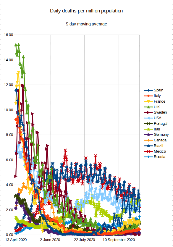
Fig 2. Five day moving average of the daily coronavirus deaths per million population of some countries in the northern hemisphere
Unfortunately, as the daily deaths decreased and the curves merged, it became difficult to resolve the changes expected after the surge in infections in Europe during September 2020. As a result, I have split the countries I have been monitoring onto separate graphs.
Some southern European countries.

Fig 4. Five day moving average of the daily coronavirus deaths per million population of some southern European countries
Comparing fig 4 to fig 2, you can now see the increase in the daily number of deaths in these countries from October 2020, which was partially masked in fig 2.
Italy was hard hit during the second wave, looking at the width of the wave, taking into account the three sub-waves. (17 December 2020)
Portugal was the worst hit country in my sample group during the European "second wave", with almost 21 deaths per million population per day. Only the UK has come close to this. (23 January 2021)
Of the countries I have been monitoring, Spain and Italy were the first to pass 1000 deaths per million population during the second wave.
Some northern European countries.

Fig 5. Some northern European countries and the UK
I was monitoring Sweden, but their reporting of deaths was absolutely atrocious. The daily variations in their numbers made the data unusable, so I stopped charting them.
The UK's numbers did follow the European trend of the second wave, with a spike in late September/early October. Their daily deaths have maintained the same rate in spite of their changes to the way they count the deaths on two occasions. They do seem to have passed the peak in the second wave, but time will tell. (17 December 2020)
There was much hype around the delta variant when it hit Europe in the northern summer of 2021. However, relative to the UK-variant, far fewer people died in the third wave than the winter wave of 2020. Whether this was due to vaccination levels remains to be seen.
Russia's curve was rather strange as it did not seem to be following the pattern of other European countries I am monitoring. However, their death rate numbers did seem to follow the second wave spike experienced in the other countries. (17 December 2020). Their third wave, which started in May 2021, seemed to have reached a peak, when it suddenly started surging again in September 2021.
The Americas
One of the countries I was interested in was the USA. For completeness, I decided to follow its northern and southern neighbours as well. As Brazil, like Sweden, was following a hands-off policy towards the virus, I included them.

Fig 6. Some countries from the Americas
The second wave of deaths in the USA can almost certainly be attributed to the riots following George Floyd's death (May 2020).
As you can see from the curves, Mexico and Brazil initially followed pretty much identical death rates, but then Mexico's second wave occurred around the same time as the USA's third wave. Brazil had a massive spike in death rates in April and May 2021, when both Mexico and USA were coming out of their respective waves.
Other countries
As I am most interested in South Africa, this has to be included! Iran is included as it was one of the first countries to be hit by the disease. India is included for the sheer size of its population, and the widely differing social standings of the population.
At the start of the epidemic, I was also recording China, South Korea and Australia. However, these countries stopped producing interesting data very early on in this exercise, so I stopped monitoring them.
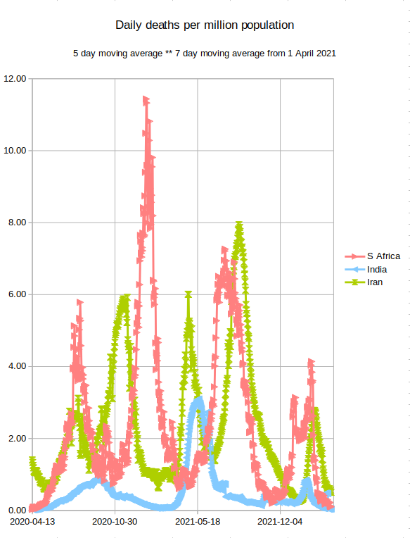
Fig 7. Iran, South Africa and India
Iran has the strangest curve of any country I have been following. The deaths were decreasing after their initial outbreak, but then after Ramadan started increasing drastically again. This peaked around 28 July 2020 and decreased for about month, when a third wave started. I would be very interested to know the reason for this third wave. At the moment (17 Nov 2021) they have been through their fifth wave.
India is also an interesting case as the death rate due to the virus is remarkably low. Their first wave peaked around 20 September 2020, long after the rest of the world had been through at least a second wave. Their death rate from the second wave (remember, the delta-variant originated in India), was still remarkably low, when compared to other countries.
South Africa had one of the strictest government enforced lockdowns in the world during the first lockdown. This included a curfew, a total prohibition on the sale of alcohol and tobacco products, and a total shutdown of international travel. Although there were a large number of infections, the death rate remained very low.
On 6 January 2021, an announcement on the South African Covid-19 update webpage said that 884 deaths had been reported. However, 452 of these deaths were due to "data reconciliation" from May to November 2020. In order to prevent a massive spike on the graph, I spread these 452 deaths over the period of the second wave in South Africa (29 November 2020 to 6 January 2021) as it would really require a lot of effort to correct all the data from May 2020 to 6 January 2020.
The 452 deaths reported from the Eastern Cape are as a result of data reconciliation dating between May and November 2020- this includes analysis of community cases where post-mortem swabs were taken for COVID testing and analysis of clinical records where the the diagnosis was unconfirmed at the time of demise. The National Department of Health is engaging the province to investigate the details of the reporting backlog.
On 19 January 2021, South Africa had another exceptionally high death count (839 deaths). Here again, some of the deaths were attributed to "data reconcilliaton". Unfortunately, this time no count of the data reconcilliation was given.
The high number reported today is due to data reconciliation as part of the regular auditing pro- ces- this includes the analysis of community data taking into account (amongst others): post mortem swabs, backlogged data and unconfirmed outcomes at facilities.
(updated: 17 November 2021)
The media often misleads the public as to the vulnerable age for the virus. This is often touted as being between 60 and 69 - this is not true.
South African Infection Rate
I wasn't going to include infection rates, but Niko's graphs are astounding. I honestly wonder why the South African government hasn't asked for his advice rather than some of the clever people they are using.
Niko predicted the second wave on 4 December 2020, long before the decision makers did - it's a pity that these decision makers rely on non-scientists to assist them in making their decisions. The government introduced a hard lockdown on 29 December 2020, almost four weeks after Niko's prediction.
His graph shows positive infections per number of tests.

Fig 8. Second wave of infections in South Africa (4 December 2020)
His word were, things do not look good. This was three weeks before the South African government implemented the second hard lockdown.
The second wave of infections is now looking really bad, as is shown in figure 9. (30 December 2020)

Fig 9. Second wave of infections in South Africa (30 December 2020)
The second wave of infections peaked around 1 January 2021 as shown in figure 10, and the expected winter wave peaked around 11 July 2021. As with the second wave, Niko predicted it several weeks before the clever people even started mentioning that we were in a third wave.
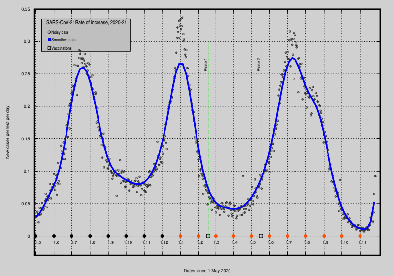
Fig 10. South African waves of infections (28 Nov 2021)
Phases 1 and 2 in Fig 10 show the vaccine rollouts in South Africa. Phase 1 was for medical personnel and phase 2 for the general public.
Unfortunately, Fig 10 is showing the dreaded upturn for the fourth wave (21 November 2021). As a scientist, looking at this graph, it is very cyclical, except when the masses disobey the rules, as with the South African riots towards the end of July. This took almost a month to show up in the data as can be seen from the shoulder on the right hand side of the third wave.
Fig 11 shows how rapidly the omicron variant of the virus spread in the space of 1 week.
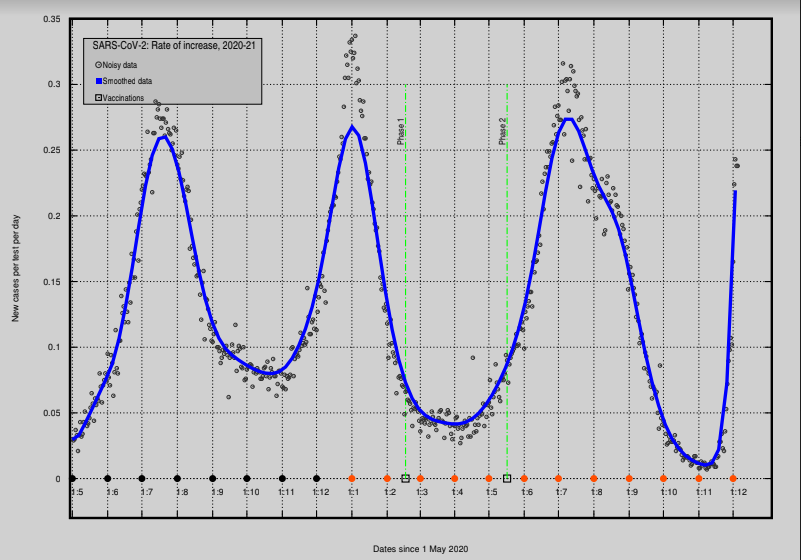
Fig 11. South African waves of infections (5 Dec 2021)
Currently (12 December 2021), the rate of infections seems to be decreasing.
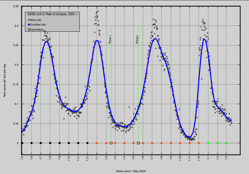
Fig 12. South African waves of infections (12 Dec 2021)
(updated: 13 December 2021)
Notes
1: I started the data collection on 23 April 2020.
2: For consistency, I try to collect the data daily between 09:00 and 11:00 SAST (GMT+2).
References
The population numbers were taken from Google on 23 April 2020
The deaths per country is from Worldometer. Worldometer does have a table filled with various numbers relating to the coronavirus for the whole world, including deaths per million. However, I was interested in a much smaller subset.
Data preceding 23 April 2020 was collected off Worldometer's daily death graphs for each country shown above. I could find no other way to access this data.
(updated: 4 December 2020)